
On the run-up to Black Friday, UX could be the difference-maker for your eCommerce site to convert leads into customers.
If it turns out to be a record-setting Black Friday, you’ll need an eCommerce store that’s reliable, secure and that gives shoppers an exciting Black Friday shopping experience.
Of course, it’s too late for a complete eCommerce overhaul. However, one of the easiest ways to improve your website is by focusing on your user experience. Let’s take a look at 8 tips for improving your Black Friday UX.
If you want to learn more about how to be fully prepared around UX or operations for Black Friday, sign up for our upcoming webinars here.
No automatic carousels or sliders
A few years ago, sites used hero sliders or carousels which would automatically animate and place more content on the homepage. But, the data and studies have shown that slides and carousels are not user-friendly. Firstly, people hate sitting through the rotating images. Secondly, they never click through them. As a result, you’re hiding messaging that could appeal to your customer more.
 |
The best practice now is to avoid automatic carousel sliders, but you can have a manually operated slider instead. Here’s why: with a manual slider, you can swipe through and not obscure your top-selling products. That’s an easy one to get wrong.
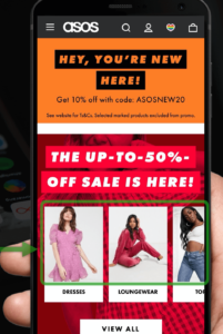
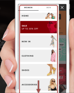
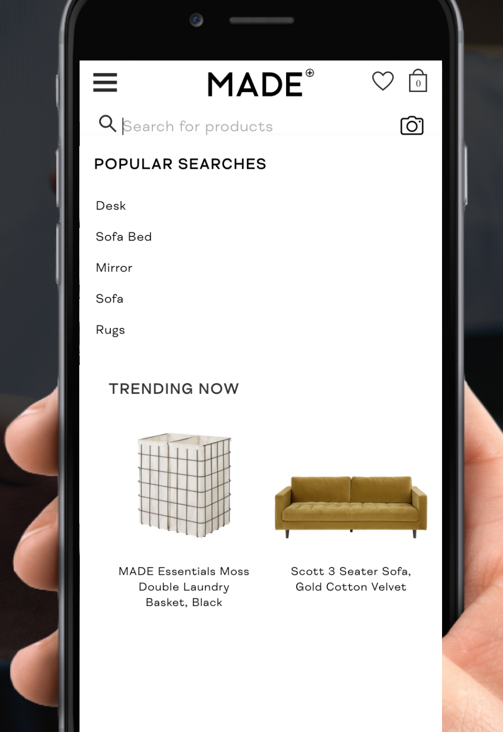
Keep the options on one page
Once you’re within the menu, you can see ASOS doesn’t keep their options on one page. Only a quarter of their menu is visible, though they have much more information on their eCommerce store. Instead, they expanded a few options with images and bigger buttons for a more touch-friendly approach. Only five or six options are available. I’d say ASOS made a conscious decision to show their top options here rather than their full menu.
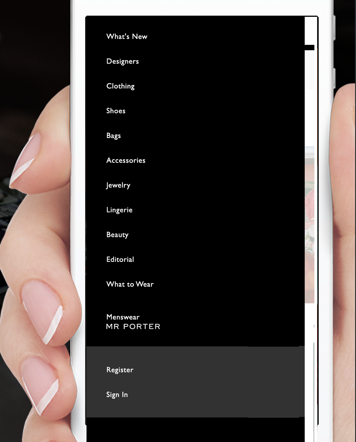
Here are a few examples where keeping the options on one page is done well. Net-A-Porter is in a similar sector and slightly higher-end. In their case, they maintain a styled menu, and they condensed their menu onto one page. The advantage is that the user doesn’t need to scroll.
 |
 |
One other example is On Running, which offers a hybrid between the ASOS and Net-A-Porter user experiences. They also use iconography and consolidate the menu. As you can see, it’s straightforward and clear. For this reason, they give a great example of keeping the options on one page inside a console.
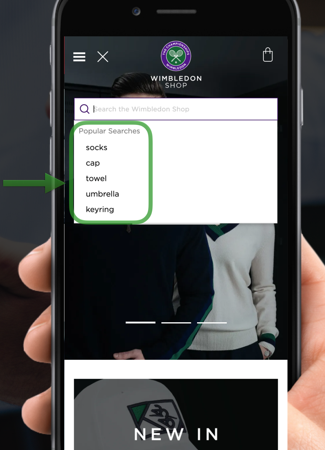
Use auto-suggestions
The moment you click into the online shop, you see the top five popular areas in the search bar.
 |
 |
Of course, the use of auto-suggestions comes from the expectation that people are lazy. If a customer types a request into Amazon or Netflix, they only want to type the first three or four letters and then receive suggestions. It’s essential, and customers expect the website to respond to their queries in this way.
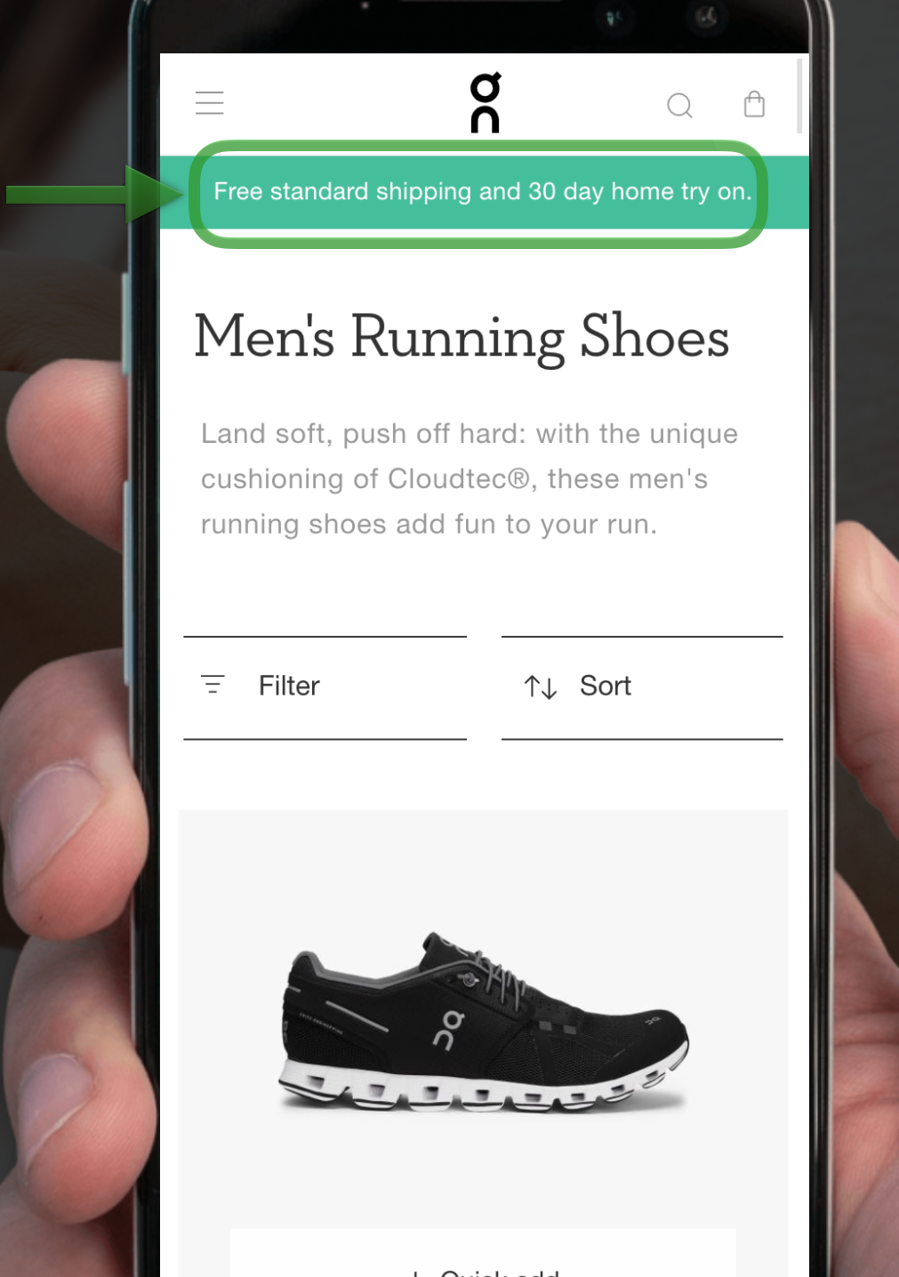
Category: Value Proposition Present
Similar to homepage and landing page, make sure you include a value proposition on the category page. On Running does it well. It’s clear but not too in-your-face: Free standard shipping, which is great for conversion and 30-day home trial as well as reassuring you that you should purchase their product.
Unique Product Descriptions
Perhaps, this deviates a little from UX, but it’s a necessity. Certain retailers dedicate a single line of copy from the manufacturer, or they’ll say, “Oh, an intern will come up with a product description,” or they will use marketing boilerplates. One line and a couple of bullet points don’t make your products stand out. Unique well-written product descriptions from copywriters are fantastic and make a big difference.
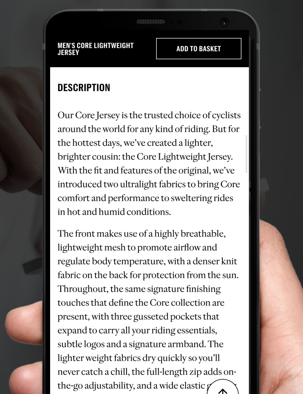
Rapha excels on product descriptions. Their descriptive text heightens the user experience and also improves SEO.
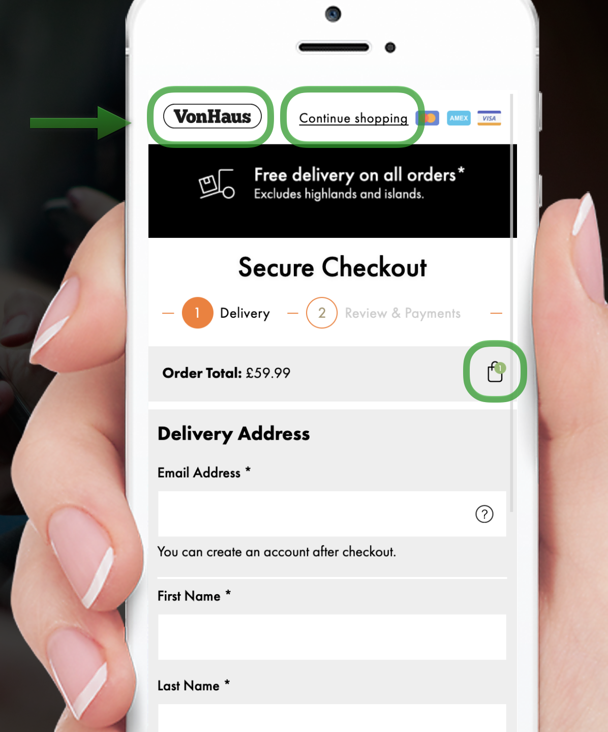
Encapsulate the Checkout & Reduce Checkout Points
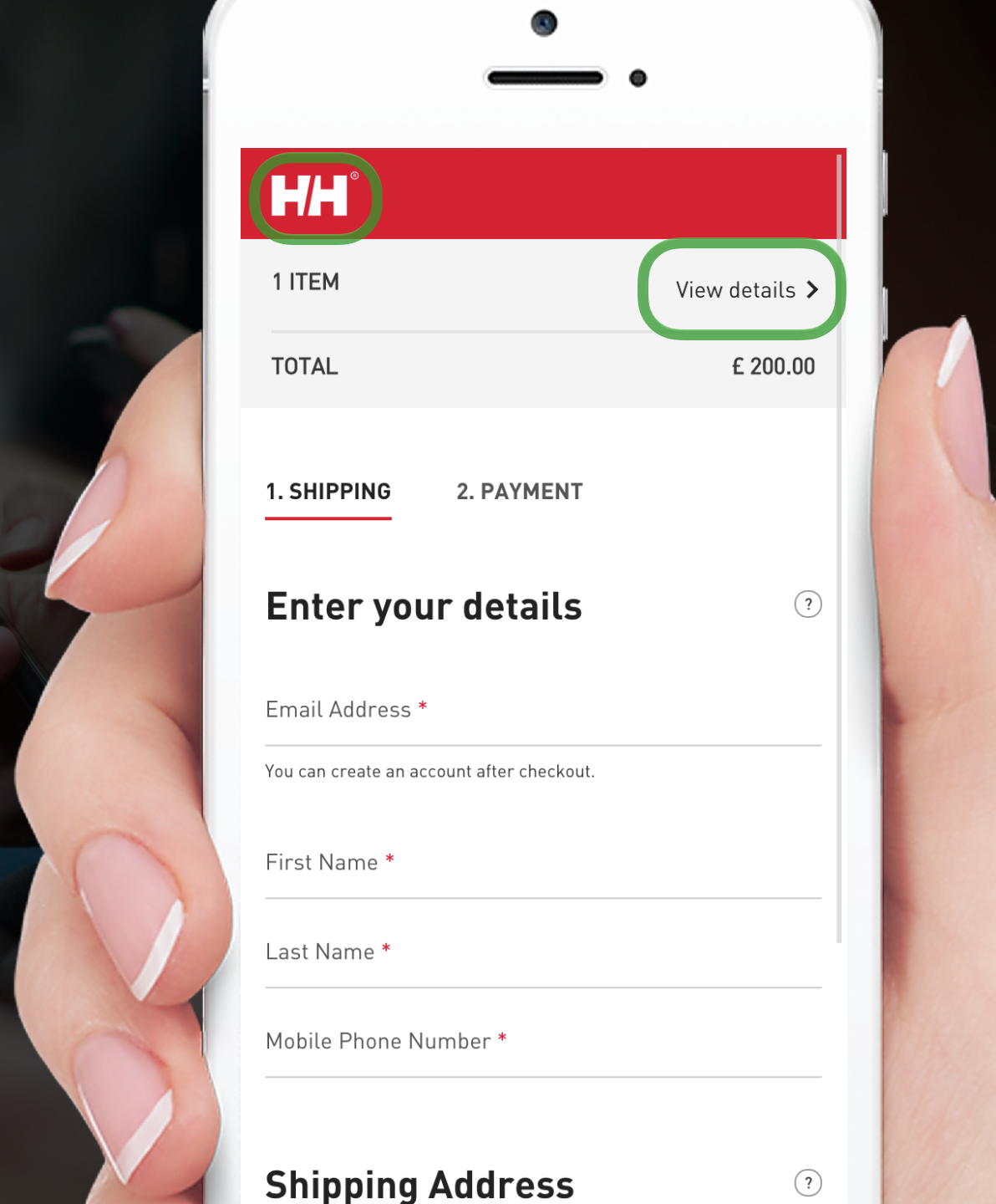
Encapsulate the checkout and reduce exit points where you can. On the VonHaus page, you probably notice that you cannot see the hamburger menu or the search icons. The removal of these icons is an intentional choice to keep the user from leaving the checkout. And now we just have the logo at the top corner. So, they’ve kind of got three exit points there you can click on the logo, go back to the homepage, go continue shopping, or you can go back to your cart. So, the act of limiting checkout points represents the sales funnel. With a limited number of exit points, people stay focused and check out more. Helly Hansen takes another step further and eliminated everything but their logo.
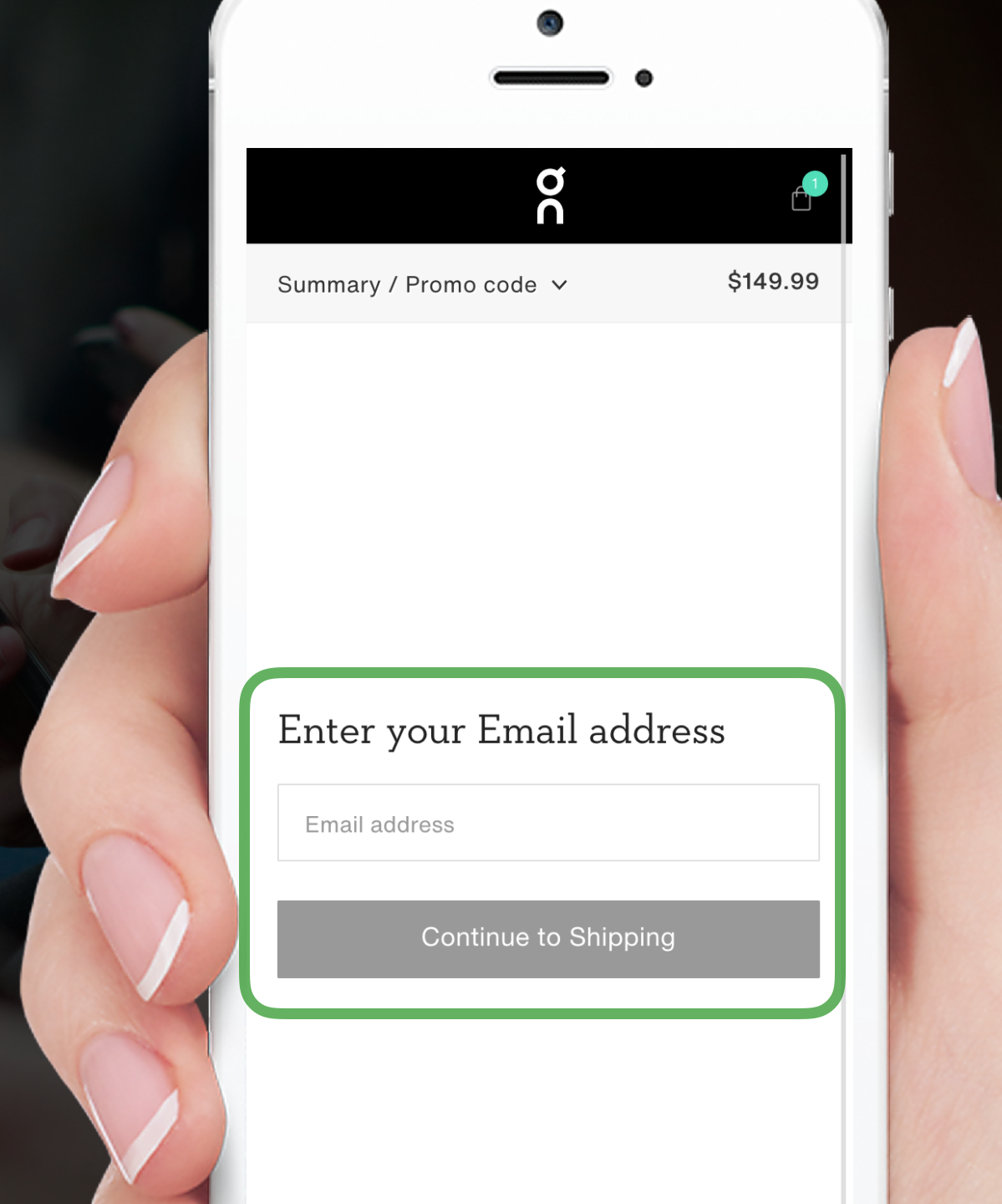
On Running goes a step further. They emptied the page apart from the chance to enter an email address. The reduced checkout points give a clear and strong signal to the user. Follow Steve Krug’s book “Don’t Make Me Think,” reduce the number of fields to streamline the user’s attention. On Running most likely receive higher conversions by leaving one field and stripping everything else from the page.
Use a stepper for numerical entry
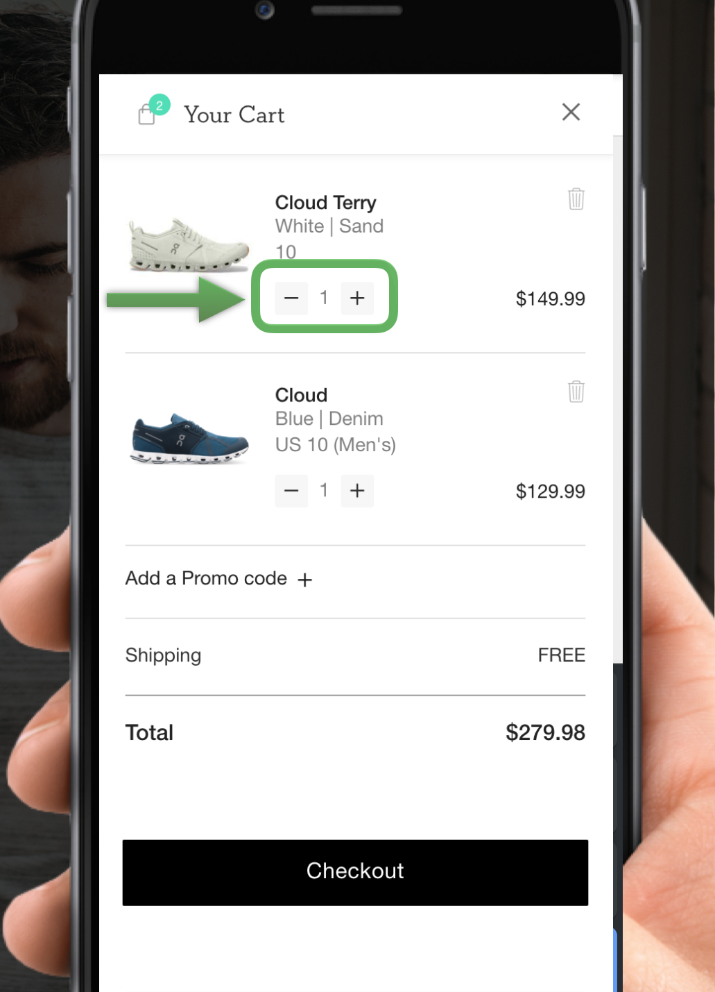
With On Running, you find an easy quantity change option with plusses and minuses. Both symbols offer a touch-friendly and understandable experience for the user.
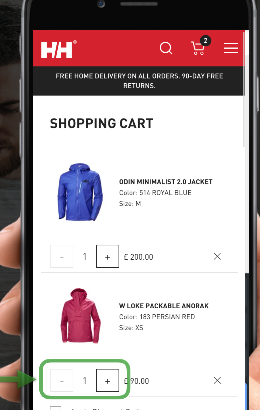
On the other hand, Helly Hansen uses a hybrid version where you can click a plus or a minus. But also if you add an unwanted item, then you can remove it from your cart. The user can disregard the plus or minus altogether if necessary, and type directly into the field. If a customer wants ten jackets, they click in the space and type 10, and the form updates. Steppers offer a simple and intuitive way to add or subtract products.
Extra: Embrace mobile-first
You won’t see a person lugging their monitor onto the bus every morning. Mobile-first should be the default as cell phones are here to stay. Customers might not own a desktop with a quality screen, but they carry a mobile phone everywhere with them. For this reason, always put mobile above other mediums.
About Vaimo
Vaimo is a global expert in digital commerce. As an omnichannel agency, we deliver strategy, design, development and managed services to brands, retailers, and manufacturers.
We drive success in digital commerce with expertise in B2B, B2C, PIM, Order Management, and ERP integrations. With 10+ years of technical excellence, we support clients in business development, digital strategy and customer experience design.
With offices in 15+ markets and over 500 employees across EMEA, APAC and North America, we provide an international presence that allows us to cultivate close, long-term relationships with our clients. Contact us here if you want our advice on how to get maximum out of Black Friday for your business.