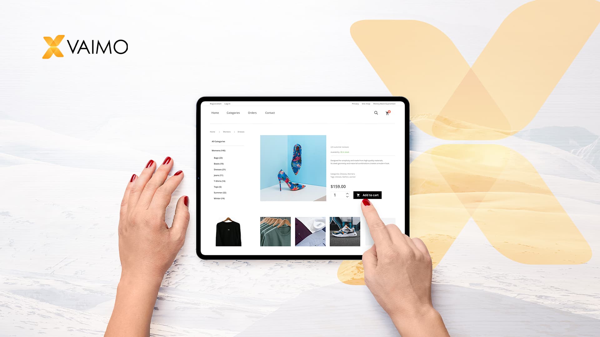
The cart page of any website is critical to the conversion process. It is the final step in the customer journey and transitions your visitors from product discovery to checkout.
Yet, too many websites rely on standard out-of-the-box cart designs and fail to make the most of this process. With an average cart abandonment rate across all industries sitting at 69.99%, getting the cart page right can significantly impact your KPIs.
Let’s dive into best practices to reduce cart abandonment and explore creative ways to turn this fragile step to your advantage.
TABLE OF CONTENTS
1. The rise of drawer carts
2. Trust badges
3. Payment options
4. Cart vs wishlist
5. Increasing AOV (Average Order Value)
6. FOMO
How Vaimo can help
1. The rise of drawer carts
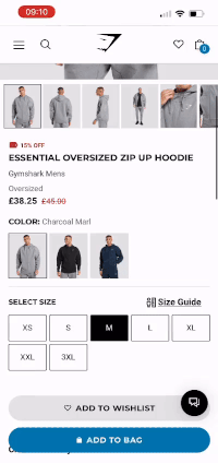
In recent years, drawer carts have risen across some of the fastest-growing retail brands ( Gymshark, Gisou, AllBirds, The Big Silk, Colourpop). The reason behind such a rise in popularity goes back to the basic principle of ecommerce UX: offering a frictionless shopping experience.
In that respect, drawer carts offer many advantages:
The cart is conveniently available throughout the shopping experience
Offers visual confirmation the product has been added to the cart
Displays the current cart content without being redirected to a new page
Minimizes the risk of loading issues compared to a standard cart page
Allows starting the checkout process with a single click
Drawer carts are mobile-friendly and follow mobile-first design patterns
Related reading: Headless commerce
2. Trust badges
According to large-scale UX research by the Baymar Institute, 18% of visitors will drop out from checking out due to a lack of trust in the website managing their card details.
The topic of trust between a customer and an ecommerce website is not limited to payment method details, or whether a transaction is secured; it also includes personal detail management, business legitimacy, or simply product quality.
Your cart offers the perfect real estate on your website to boost confidence and remove any remaining concerns to seal the deal.
Here are a few badge examples that can find their way into your cart:
You can emphasize website security by showing your customers' transactions are encrypted with SSL and potentially further secured by third parties such as Norton or McAfee.
With privacy being one of the most controversial topics over the last few years, people are becoming increasingly reluctant to share their private information. Showing you are fully GDPR compliant will put more people at ease, knowing they are in control of the details they share, and they can request that they be removed entirely from the merchants’ system.
First-time buyers getting cold feet? It is common for people to end up on new websites after doing a Google search. While your front end looks ace, many questions can come to mind when it is time to check out, like, “Is this a legitimate business? What is the quality of the products? Is the description accurate?”
The best way to establish your legitimacy is through social proofing. When you display your review count or overall seller rating, you are reassuring visitors by letting them know that other customers have had a great purchasing experience with your business.
Another way to show legitimacy is by displaying third-party endorsements, such as being a BBB-accredited business in America or partnering with established charities.
What about product quality? Not sure about the color and how it looks on the screen? Sizing could be an issue. You can remove risk associated with the transaction with a simple free return or a money-back guarantee badge.
3. Payment options
More and more people are shopping online but want to do so on their own terms.
New payment methods have flourished over the last few years, and they all try to serve the same purpose, offering customers convenience. Ultimately, convenience is a personal experience that can mean many things depending on the customer and its demographic. For example, we have seen an incredible rise in BNPL popularity for Gen Z thanks to the ability to spread the cost or pay later. At the same time, older generations tend to favor Paypal or American Express.
With a staggering 9% of customers abandoning their cart due to a lack of payment method available, localizing your payment offering is a great way to decrease this abandonment rate. In Europe, 25% of online transactions are made using local payment solutions. That number goes as high as 78% for countries like Belgium, where Bancontact and Maestro dominate the online payment landscape. Boleto in South Africa and AliPay in China are other examples of very popular local payment options.
Pro tip: having an IP-based dynamic payment logo section is an excellent way to manage the content block and keep it relevant for all your customers.
What’s the next big thing in terms of payment options? Crypto wallet integration is certainly one to watch.
Related reading: 5 ways to maximize your ecommerce ROI
4. Cart vs wishlist
While many online stores offer a wish list feature to keep track of potential purchases, it often requires opening an account along the way. This is a massive turn-off; in fact, compulsory account creation accounts for 24% of cart abandonment.
UX research has demonstrated that it was very common for people to use the cart page of a website as a temporary wish list - items are being added to the cart without the intention of immediately purchasing. This phenomenon pushed giants like Amazon and Walgreens to introduce a “save for later” feature for in-cart items.
The real challenge is to make it easy for those returning visitors to find their saved items. They will indeed be reluctant to go through their search process again, which might cost you that conversion. So where do people expect to see those “saved for later” items when they return to the website? You guessed it, right back at the bottom of the cart!
5. Increasing AOV (Average Order Value)
Running a promotion? It is probably all over your homepage with nice banners, but when your customers have navigated your website and wondered about the many products you offer, is that promotion still fresh in their minds?
They may have initially clicked on an ad and landed on a product page, altogether skipping your home page. Reminding people of limited-time promotions or product-specific offers could convince them to checkout now rather than later or add additional products to their cart.
Some brands also use this space to display information about their loyalty program and the number of ”points” visitors would get with that purchase. This is a nice example of showcasing additional value with purchase.
Incentives: A good way to increase your average order value is to incentivize people to buy more. A great example successfully executed by many retailers has been implementing a free shipping threshold and a visual way to show customers how close they are to that threshold in the cart. Coupled with a personalized in-cart product recommendation, your visitor only takes one click to add a product to their cart and secure their free shipping.
Cross/Upsells
It is very common to find upsell/cross-sell offers at the bottom of a product page, representing a great opportunity for product discovery. Though, the cart page remains the holy grail placement for those offers because you know exactly what your visitor is about to buy at this stage of the journey. This is your chance to offer upgrades, or complementary products, with the highest level of relevancy.
Buying a new top? Fashion brands do a great job suggesting their visitors “complete the look.”
Buying a new phone? Make sure you keep it scratch-free with a matching case.
Pro-tip: AI can create personalized product recommendations for maximum efficiency with the help of 3rd party apps.
Related reading: Checkout conversion optimization: Checkout length
6. FOMO
A good way to convert hesitant visitors into customers is to create some sense of urgency in the cart. Give them an extra reason to checkout now rather than later because they could be missing out.
Countdowns are king when it comes to creating urgency and can be used in many ways. Their most obvious use case is associated with offers ending soon, but it can be more subtle.
Asos, for example, opted for an in-cart timer confirming how long items would be held for the visitor. Psychologically, this implies that those items might not be available anymore after that timer runs out, and the visitor might be missing out if he does not act now, especially in the fast fashion industry. This technique is even more powerful when combined with a low stock level indicator for specific items.
In a world where Amazon Prime shapes customers’ expectations for logistics, timers can also be leveraged to encourage customers to place their orders before the next day's delivery window closes.
How Vaimo can help
Conversion rate optimization is a long-winded process that implies a lot of work and testing across your whole website. However, as demonstrated above, your cart is one of the most critical pages in the purchasing process and offers a wide range of opportunities depending on your vertical. Clever tweaking can greatly impact your cart abandonment rate and ultimately boost your conversion rate and your average order value.
At Vaimo, we help businesses optimize their conversion rates and improve customer experience. Contact us to let us find a solution that’s right for you.Sources
48 Cart Abandonment Rate Statistics 2023 - https://baymard.com/lists/cart-abandonment-rateBNPL service in the United States from 2020 to 2022, by age and gender - Statista.comPayments in Europe - statistics & facts - Statista.com